The Thing Under The Tree

The Thing Under The Tree is a video made by the artist Lily Fang, who was a finalist for an “Adobe Design Achievement Award” in 2013[1]. The fantasy genre is not the one that first appeals to me, but I decided to have a look at it anyway with an open mind.

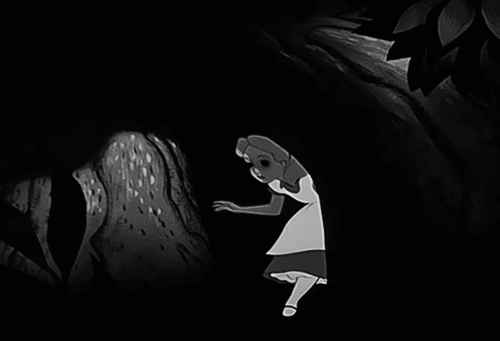
I was pleasantly surprised to find that right from the beginning I identified with teenager Tam, who was split between playing with her cellphone and entertaining her younger sister (I have a six years younger sister). Annoyed by the constant requests of her younger sister Gabby to tell her a story or play with her, she takes Gabby outside and invents a story about a monster that lives in the forest. She tells her that she should never let the monster see her face.  When her phone rings, she has to go and doesn’t have the time to tell her sister more about the “thing”. So, Gabby is left with only her imagination to entertain herself, alone in the forest.

From this moment, the movie does very well in switching between the realistic and fantasy realms.

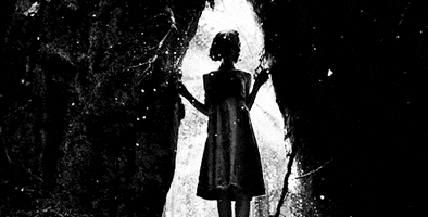
From an artistic standpoint, the detail of the forest and the figures is absolutely amazing.  Since it was an “Adobe Design Award” nominee, I’m assuming all of the elements were computer generated.  But, the attention to detail in the bark, the pieces of chestnut shells, sticks, acorns, and grass, etc. in the forest seem as though the artist has actually constructed the scene with actual materials.

Indeed, the forest they enter is far from any real forest but the details enable you to understand that this is a forest.

The fantasy comes with the imagination of the younger girl imagining the “thing under the tree” once her sister leaves.  As an homage to ‘Alice in Wonderland’, or ‘Pan’s Labyrinth’, Gabby looks into the lair of the “thing” and decides to enter. Eventually, her older sister will enter in the fantasy as she returns to apologize for leaving Gabby in the woods… the adventure is well underway by that point.

Aside from the fact that I love to have been thrown into a microscopic universe, surrounded by organic matter that looks and sounds, well, real, the movie is visually pleasant and could be a comment of how electronic devices –like a cell phone- takes away our need for creation or limits our imagination. I urge everyone to take five minutes to watch it, especially for the aesthetics and the whimsical story.

[1] Vimeo, “The Thing Under the tree”, accessed November 14, 2014. https://vimeo.com/68866825.

Gravity of Center

This short film is directed by Thibaut Duverneix, French artist and Fine Arts honours graduate[1] and American Victor Quijada, former resident choreographer at Place des Arts (Montreal).[2]  When I found the video, I read the accompanying summary, which states:

“Gravity of Center is a poetic investigation of the herd vs. pack mentality, the dichotomy of abundance and scarcity, and the inner conflict between social assimilation vs. the need for individualism.[3]

With these words in mind, I viewed the piece and therefore I didn’t have a chance to find my own interpretation, but I will comment on how the summary is reflective of this dance piece.

I found that the exploration around the theme of “the internal conflict between social assimilation vs the need for individualism” was a success.  The solo dance performed at the eight minute mark is one example of this, but there are several.  The dancer, prior to this, demonstrates her desire to emancipate from the group (pack or herd).  Once she does remove herself, the joy she feels is evident, but she seems so fragile, so conflicted about her newfound freedom… it really resonated with me.  It did so because I have had this feeling in the past, and I told myself that everybody must have felt that way because, I believe it to be a normal feeling when we grow as adults and change our bonds.  Leaving the family, moving short or long distances, people often have these mixed emotions as they move, form new groups and connections, etc.

I found also interesting how the dancers interpret the differences between the herd and the pack. It becomes clear as we watch the performers that in the outdoor setting (which I see as the herd), the people are supportive of eachother, allowing various individuals to come forward to lead from time to time, curious but cautious.  In contrast, within the pack (which I believe is represented by the indoor scenes) the different beings are more aggressive, somewhat violent, stronger and more sure in their movements, and seemingly all “fighting” as one tries to ascend or break free.

Even if in general I loved the video, it was not clear how the notions of abundance and scarcity were explored or expressed.  I suppose the rich, wide open and endless space that was the outdoors, contrasted by the stark, confined and “empty” factory space may have some clues, but this was not as well articulated as the synopsis lead me to believe.  From a choreographic standpoint, from time to time I had difficulty finding the harmony between the dance movements and the music, especially in the opening scene.

That being said, I really appreciated the final scene: In my mind the pack finally accepted that one of its members will go on by herself. I’m not totally sure that it is what is represented here or if it is the opposite, and they ultimately rejected her, but I appreciate this being left as a sort of hanging question for the viewer.

In general, I really enjoyed this piece for its beautiful scenery, the incredible choreography, and because the mesmerizing dancers pulled me out of where I was when I started to watch it, into other episodes of my life.

[1] Thibaut Duverneix, film and interactive director, “ABOUT”, accessed November 08, 2014. http://www.thibautduverneix.com/filter/interactive/ABOUT.

[2] Victor Quijada, The Canadian Encyclopeadia, accessed November 15, 2014. http://www.thecanadianencyclopedia.ca/en/article/victor-quijada/

[3] Vimeo, “Gravity of Center”, accessed November 13, 2014, https://vimeo.com/30708149.

Animate Objects

This entry is based on an animated piece done by Canadian artist Jamie Q from 2003[1].  After my first watch-through, I thought that this video was aesthetically pleasing, but a bit lacklustre and dry; I could not find much to it. For my interpretation I have divided the film into three parts.

The first twenty seconds (Part 1) shows time-lapse photographs of shadows on nondescript high-rise buildings.  This makes me think of the rhythm of the days and nights, and being a witness to time going by.

Part 2 features stop-motion photography of various metal objects moving around the screen, with different pieces being painted from frame to frame, as the objects move and interact.  As she applies the colours to the metal pieces there seems to be a similar rhythm, and some similar shapes to what she showed in Part 1, reminding me of the silhouettes on the buildings and again the passing of time.

When the video changes again to the blue wooden painted pieces (Part 3), they move toward a certain order and have a similar rhythm to their movements as parts 1 & 2, however, this could just be the frame rate.  The colour palette that she chose also feels like water or waves.  Just as the pieces assemble into an identifiable pattern, a large metal object appears and casts the “water” into chaos once again.

I believe in these three parts the artist may be representing humans intervention in the natural environment, creating chaos (Part 3), the intervention of humans on the built environment (Part 2), and the environment’s influence on the built/human in Part 1.

While I don’t know if there was meaning at all behind the work, after several views and considering what it was she intended, I certainly no longer feel that the piece was neither dry nor unexciting.

[1] Vimeo, “Animate Objects (silent)”, accessed November 07, 2014, https://vimeo.com/37492406.

BONUS; LondonFuse interviews Jamie Q!

Stealing Beauty

Guy Ben-Ner is an Israeli artist who creates humorous video installation. He works with  remarkably simple sets and props, casting his family members in his kitchen or public spaces[1]. For Stealing Beauty, he set a camera on “auto” in Ikea showing rooms. He films his family following a script that has some reminiscence of a sitcom. This little witty team travels from Ikea store to stores, all around Europe. So, they basically turn until asked to leave by Ikea staff.[2]

During the first scene, Ben-Ner who acts his own role, being father of two kids, arrives home and disappear behind the shower curtain. We hear water run. His wife arrives and peeks in the tub, surprising him masturbating. Coming out, he protests that he was washing only. Then, his kids arrive home and the mum announces that they both misbehaved. At this point I was thinking that he was just mimicking a soap opera. The music really recalls it also.

As he lectures his son, who just stole something from the neighbour, that he has to earn objects he desires, he cites their family house and asks his son if he thought that he stole it. The paradox created here talking about property when he’s in fact using a public space is suddenly enhanced because an Ikea client put her face right in front of the camera. I enjoyed that moment because even if it was more or less expected, it wasn’t planned to come at that particular moment. And there, I thought, that’s it! The interest of this short movie is created by the funny visual issues due to the specific site of filming. And they surely kept coming up. For example, we see the wife looking very anxiously at people approaching the camera. The artist asks clients to move on at a point when they’re really staring at the family. Or I noticed that the couple bedroom isn’t the same in the morning than the one they fell asleep in.

However, as the story goes on, a deeper purpose to the video appears. Indeed, political statements come into the conversation he’s having with his children. When he defines the “private property”, and says you can claim something yours as soon as you kick the people out of it, he seems to make references to Gaza Strip. My opinion got more and more confirmed as the movie rolls on. I love how the Ben-Ner family acts like old nomads looking for a land as they move from an Ikea to another when as the same time Ben-Ner Dad discourses about private property and bordures issues. I appreciate how subtlety the political purpose came to me and not with a really clear position.

In my opinion, it is clearly a “must to see” as  it shows a very creative and sensitive approach to a political issue but it also inspires a reflection about a subject, that  token at a minor scale, can be more personal matter.  In addition, the creativity, wittiness and humour of this short film makes it very enjoyable.

[1] National Gallery of Canada. “Collections, Guy Ben-Ner.” Accessed November 06, 2014. http://www.gallery.ca/en/see/collections/artist.php?iartistid=43591.

[2] New York Art. “The Art Review. Artist in Residence.” Accessed November 06, 2014. http://nymag.com/arts/art/reviews/43567/.

MA-KU

“MA-KU” is a video piece by American photographer John Santerineross. It has been featured in an exhibition at the Arteleku Contemporary Arts Center in San Sebastian, Spain in 2010. The work was inspired by one of Santerieross’ photographs1 and it’s a pastiche of two separate images – the first is a mostly naked masked woman who appears to be trying to escape a metal box, and the second is rice falling into various vessels. The film moves back and forth between these two moving images: The woman gyrating and struggling, uncertain as to how she can break free of her confines, and rice falling, continuously. The sound of the individual grains of rice clinking against glass, a distant piano, and the ominous deep sound of a machine rumbling in the background are all part of the accompanying “soundtrack” for these images: There are no other sounds, nor spoken words.
Finally, the woman opens fans and disappears in a magnificent light, the video ends. At this point I feel relieved and imagine that she is liberated. I feel that the artist is using this piece as a metaphor of life; with its struggles, the falling rice representing minutes, days, and months always ticking by. The light at the end of the video symbolising death, or freedom, or both.
I wonder why Santerineross chose a nude female figure for this piece. It certainly made me feel uneasy that she was naked and that her face was hidden. I felt like I should not be looking at her, because she doesn’t know I’m there. Was it intended that the audience would have this voyeuristic feeling and for what reason? The piano music is somewhat calming music but also a bit disjointed, acting as a soft echo of joy barely perceptible behind the droning sound and the feeling of watching something I wasn’t supposed to. There was something about the tone of the piano notes that made me feel almost as if it was okay to watch.
The crown on the gyrating figure’s head is reminiscent of the ‘nimbus’ found in medieval art. As they were reserved for holy people, I am not certain to understand the meaning of using it in this piece, other than as a criticism of Christianity; who tried to give meanings to life, its struggles and that promise of an afterlife?
Overall the performance comes together to create an interesting piece that leaves you uncertain and thinking about the human condition. It’s dark imagery and strange sounds lending to the uneasiness and uncertainty of what is to come.

1 Vimeo LLC, “MA-KU”, accessed October 20, 2014, https://vimeo.com/13045739.

Tie Me Up! Tie Me Down!

I’ll preface this review of Almodovar’s “Tie Me Up! Tie me down!” (Atame!) (1989)[1], by stating that it is not my favorite from the director.  This movie does not have the multitude of interesting characters, locations or interactions between its many players.  However, saying that this is not my favourite, it’s still an Almodovar; which is like trying to differentiate between what’s my favourite Talking Heads album… they’re all Talking Heads albums, and therefore all amazing! Lol.

This movie is remarkable because it demonstrates Almodovar’s distinct aesthetic, principally based on the use of color[2]. In this movie, we can definitely see his preference for red, green, blue, yellow, purple and orange.

The story takes place within rooms with red and green walls or blue walls with red curtains. A yellow, blue and red flag is decorating the female lead (Marina’s) apartment. When she calls her mother, she is wearing an orange dress and is sitting on a green chair. But if we pay attention to colors, no one can miss the predominance of the red. I really enjoy how he saturates the movie with this color.

Atame!

The main characters, Marina and Ricky, are often dressed in red and the phone that Marina uses is red. Almodovar says that for him red is the color representing life and the deepest feelings. It represents passion and fire and for him it also means the taste for risk[3].

As well, I appreciate Almodovar‘s dark humour, present in this movie. For example, when Ricky, who just kidnapped the love of his life, declares that he “had a difficult night” following all the struggles they’ve had.  At the same time, on the wall behind him is a painting of Jesus tending to his sheep.  I’m not sure if they’re juxtaposing the acts that Ricky has carried out with the religious symbolism, or suggesting that Ricky is taking care of his “flock”?

Almodovar as a director has the ability to make me laugh and move me deeply at the same time.  I can simultaneously be laughing at a character’s misfortunes while feeling deeply sad for their motivations or circumstances.  And while Tie Me Up! Tie Me Down! may not be my favourite, it’s certainly yet another excellent offering from my favourite director.

[1]Imdb, “Tie Me Up! Tie Me Down!”, accessed October 18, 2014, http://www.imdb.com/title/tt0101026/.

[2]Ugo Leonard, “Pedro Almodovar: Un cinéma entre identité nationale et émancipation”, (Master’s thesis, Université Paris I Panthéon Sorbonne-Centre St-Charles, 2013), 15-16, http://dumas.ccsd.cnrs.fr/dumas-00942399/document.

[3]Ibid.

High Heels

As Liddel states in Imdb website, Almodovar, with this movie, seemed to have forgotten what made him special in the first place: “audacity, iconoclasm and fun”[1].   This may seem true if we were comparing “High Heels” to Almodovar movies of his early carrier only. His first long movie, “Pepi, Lucy, Bom” (1980), had a very special purpose. Almodovar, who lived through the “small bourgeoisie” period in Spain, under Franco, wished to open the cinema (and the eyes of his viewers) to the new liberties acquired following Franco’s death in 1975[2]. He was intrigued by drug use, adultery, sexually “perverse”, and so on.  As well, he is representing the new artistic movement called the “Movida”[3].  “High Heels” arrived eleven years later and Almodovar, in my opinion, does not have the same urge to reflect this revolution or comment on the new freedoms.

Even if I agree that “High Heels” is less excessive and less frivolous than his early movies, I still find everything that one finds is almost all of Almodovar’s movies. His exploration of sexual identities – including positive images of transvestites, bisexuals or homosexuals – are present. Also, there is certainly an aspect or element of art, creativity and/or performance.  I appreciate that the women in Almodovar’s work are usually given the starring role, and how much the director is able to touch us views into their emotional lives.  Pedro Almodovar is a filmmaker, but maybe more than anything he is a cinema buff.  His movies are littered with references to the best of American and World cinemas[4].  In the case of “High Heels”, Almodovar references Bergman’s “Autumn Sonata”.  A film that was quite inspirational for the overall theme of “High Heels” [5]

Because the importance he gives to the music of his film, unexpected musical sequences will pleasantly surprise the spectator[6]. Something I appreciated with this and other Almodovar movies is how the lyrics of the music and the plot often match. Most of the music of “High Heels” is based on the highly expressive boleros[7]. Also, an exciting dance scene in the prison surprises the watcher and reminds one of Elvis’ “Jailhouse Rock”[8].

He is also fond of disguise and duplicity in his characters. For example the complexity of the emotional life of Rebeca (the main charachter) and how much she makes us doubt of everything she says, to finally understand at the end what was true, and what was a lie, and why she lied.

With “High Heels”, Almodovar explores the complexities of the multiple versions of oneself, through Letal, a character that exhibits three completely different personas (transvestite, detective and junkie), complete with disguises.  This suggests that human emotions and desire can be so intricate and contradictory that one identity cannot contain them all.   The only person who has a single identity dies: the macho monster Manuel.

I disagree with Liddel (2000) and believe that “High Heels” demonstrates a subdued version, and a maturation of all the characteristics that made Almodovar ‘fun’.  A trend that continues in subsequent Almodovar works.


[1] Imdb, “Reviews & Ratings for High Heels”, accessed October 10, 2014, http://www.imdb.com/title/tt0103030/reviews.

[2] Nena, “La movida madrilène et le cinema de Pedro Almodovar”, Cinémania, February 24, 2014, http://cinemania.over-blog.fr/.

[3] Nancy Berthier, ‘’Pedro Almodovar: Au commencement était la Movida’’, Paris Sorbonne, Paris IV, 2014. Accessed October 11, 2014, http://savoirsenprisme.files.wordpress.com/2014/04/5-berthier.pdf.

[4] Jean-Luc Lacuve, ‘’Almodovar et la cinéphilie: du décalage au palimpseste’’, June 1, 2006. Accessed October 11, 2014, http://www.cineclubdecaen.com/realisat/almodovar/almodovarcinephile.htm.

[5] Gwynne Edwards, Almodovar: The Labyrinths of Passion, (Toronto: Scholarly Book Services, 2002), 124.

[6] Ibid.

[7] Mark Allinson, A Spanish Labyrinth:the films of Pedro Almodovar, (London : Tauris, 2001), 201.

[8] Frederic Strauss and Yves Baigneres, Almodovar on Almodovar, (London: Faber and Faber Ltd, 2006), 112-115.

The Railrodder (sic)

In 1964, director Gerald Potterton (of Heavy Metal fame) contacted Buster Keaton to star in a short movie where he would have to cross Canada on a single person railway “speeder”.  Keaton had been a silent film star since the early 1900s and was a huge box-office draw for short and feature films; acting, directing and doing his own stunts.  In the 50s his career was resurrected with a variety of television appearances and the airing of his short films. [1]

In the movie Keaton, an American, plays the role of an Englishman who reads an ad in the newspaper urging him to “See Canada!”  The way he imagines Canada is very stereotypical – trees, Mounties, wilderness, natives and wild animals.  The entire film is filled with stereotypes – the opening scene set in England to the sound of Big Ben chiming and other scenes of London, England.

One question I asked myself is whether it’s Potterton, an English director, who makes fun of his nation for the way they envision Canada, or is it American Keaton poking fun at the British for their views on the colony? Obviously, in 1964, England and America must have had a somewhat more realistic idea of Canada than that.  Possibly, after all, there are truths in these stereotypes, even if they don’t tell the whole story of Canada.  Possibly it’s just an idea of someone who loves Canada to show some of the amazing things the country has to offer; the film was imagined as a travelogue to be shown in theatres worldwide.[2]

When the movie came out, the reviews were mixed: With some critics arguing that there was too much scenery and not enough Keaton.[3]  I totally disagree. I think what makes this movie funny is the interaction-or lack of interaction- between Keaton and the landscape. Indeed, with a camera working in a lot of different angles, we watch Keaton too busy repairing his railway speeder to notice that the bridge his vehicle is on is swinging over the Lachine canal to let a boat go by.  Also, and this is the part that made me smile the most, our English tourist is having a very precious moment at teatime with Bison staring at him.  They cannot, however, disturb the serenity that a cup of tea is bringing – another example of the use of stereotypes for comedic effect.

In the end, Keaton reaches the Pacific Ocean and finally descends from the vehicle to take in the coast, only to have someone walk out of the water – dressed identically to our hero – and take the railway car back east, where Keaton’s adventure began.

I enjoyed this movie and I had fun to identify some of the stereotypes that I was familiar with, having come from outside of Canada.  I also enjoyed trying to pick out the places that I have seen, such as those shots of Montreal and Quebec City that were identifiable to me.   Overall, this short “travelogue” was fun and interesting and totally worth the 25 minutes to watch.

[1] Albert Ohayon, ‘’Buster Keaton rides the rail in Canada’’, NFB/Blog, December 11, 2009, http://blog.nfb.ca/blog/2009/12/11/buster-keaton-rides-the-rails-in-canada/ 2014/10/08/.

[2] Ibid.

[3] Ibid.

Special Delivery

Special Delivery is an animated movie created by Eunice Macaulay; English animator and producer, and John Weldon, Canadian actor, composer, animator and movie director. In 1979, the film won the Oscar for best animated short.[1] Special Delivery has been considered the funniest short of its time[2]. I think it is a high quality movie but to simply say it’s ‘’funny’’ is insufficient. Adultery, crime, money concerns, justice, egocentrism are subjects treated in this 7 minute movie. I think it’s more a comment on humanity’s weakness and fearfulness. The funny part of the movie, in my mind, is that as the movies continues more and more bad situations, failures, mistakes and poor judgements keep arising.  As a viewer, I could not believe the accumulation of mistakes Ralph and his wife managed to make in just seven minutes.

Another quality of the movie is the simplicity of the drawing, allowing the spectator focus on the plot and not on the décor. Notwithstanding the simplicity of the animation the body’s movements are well studied and represented. Emotions are easily recognizable in the animated figures: The position of the body is often characteristic of the feeling it portrays.

The movie also comments on the justice system and the health system. Both the police and the doctor make mistakes. It makes some social observations as well: such as when the police wonder how a postal worker could own such a big house?  As well, the “fear” that many characters have of the power of the postal workers union.

In conclusion, this is a movie well put together in only 7 minutes.  It makes some big general observations, and the narrator’s steady and unwavering tone – with all of the craziness going on – almost makes the plot and the interactions seem normal or matter-of-fact.

[1] Wise, Wyndham, Eunice Makaulay, February 28, 2012, http://www.thecanadianencyclopedia.ca/en/article/eunice-macaulay/ (accessed October 1, 2014).

[2]Wise, Wyndham, Eunice Makaulay, February 28, 2012, http://www.thecanadianencyclopedia.ca/en/article/eunice-macaulay/ (accessed October 1, 2014).

PINA

PINA is a movie dedicated to Philippine (Pina) Bausch directed by Wim Wenders. Pina, born in 1940 in Solingen, Germany, was a dancer and a choregrapher and was best known for her “Tanztheater” located close to Wuppertal, Germany. Wenders and Pina were longtime friends and had been contemplating a collaborative project about Pina’s work: The project was intended to highlight Pina’s beautiful choregraphy. However, it wasn’t until the idea of using 3-D struck Wenders that the project began to take shape as a semi-biographical. Production began in 2009. Yet, six months later Pina died. After a period of mourning, Pina’s dancers and Wim Wenders decided to do the movie without her as a tribute. After all, her presence and work was still embodied in her dancers.

Never before, a movie made me realise what dance can say that words cannot.  It completely expresses what dance is, based almost entirely on visual communication.  Words fail to describe the deep emotions that this movie, and the individual performances, convey.  I caught myself smiling during the performance, and having my eyes full of tears during another one. It’s a magnificent expression of  feelings – fear, joy, calmness of soul, confidence, excitment and so on.  I believe that this movie was so powerful because of Wender`s ability to position you, as a spectator, not only from a distance, watching, but right in the middle of the group at times. Also, Wenders allows us to watch Pina interacting with her company people. It is magnificent to see a dancer create a motion based on the talk Pina and her/him just had.Wenders, by doing this, enables the spectator  to see the link between Pina and her dancers. We become witnesses of their intimacy.

Furthermore, in my opinon, the viewer is transported as if within a moving painting because of the magical aesthetic of the images and their locations. Indeed, Wenders takes Pina dancers outdoor. Dance movements and colors are combined and contrasted  with urban motion and either the greyness of the town or purity of the colors of nature.

PINA is a movie that will raise  the spirits of it’s spectators.  Dancers, lovers of dance, or even people who didn’t think they could appreciate a movie about such an amazing choregrapher. It’s a movie not only to see, but to watch over and over!